CS422 Project 2
Members:
Lubna Mirza, Yordan Machin, Kevin Tang, and Ibrahiem Mohammad
Welcome to Glass+
Our project has undergone many changes, but we've kept a central theme throughout. At the end of our journey, we've implemented an interface that we are truly proud of. Our interface is centered around simplicity, symmetry, and ease of use.
Video Tutorial
Design
Color
We chose to use a design with a light colored theme. In order to have consistency and fluidity with our design, text consists of only two colors: white and a teal/turquoise blue. We chose to use these colors because we liked the light design and the simplicity of the colors. Also, we chose to use the colors because we know they had little to no interference with color-blind individuals. This allowed us to design everything without fear of inaccessibility because of our consistent color throughout. Blue is used to highlight and to provide distinction when given a lot of information.
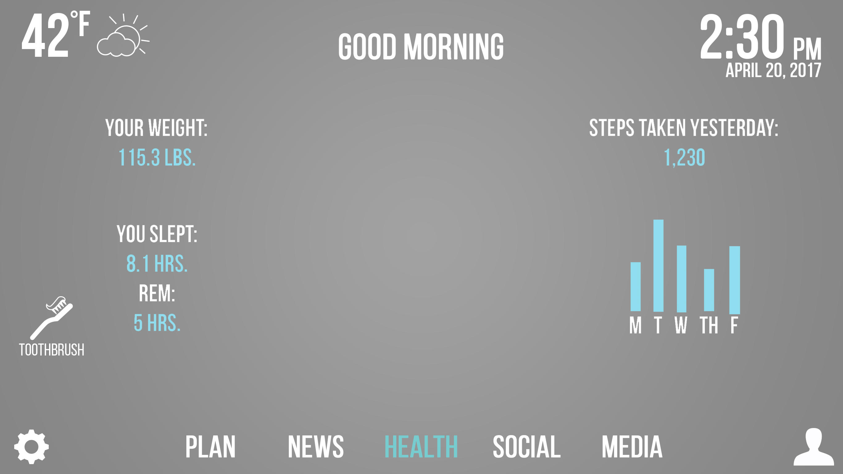
Blue helps break up the white text in the Health menu, allowing for easier readability and a elegant color pattern.
Buttons
We wanted a design that was free of clutter, and also looked clean. We chose to implement large buttons, rounded edges with our buttons, and bolded text that was as large as constraints would allow. This design idea was implemented to create a user interface that is easy to read and looks pleasing to the eye.
Buttons are large, with text large enough to cover almost the entire button.
Layout
Everything has been modified to sit on a grid layout, so that all icon and text spacing is consistent.

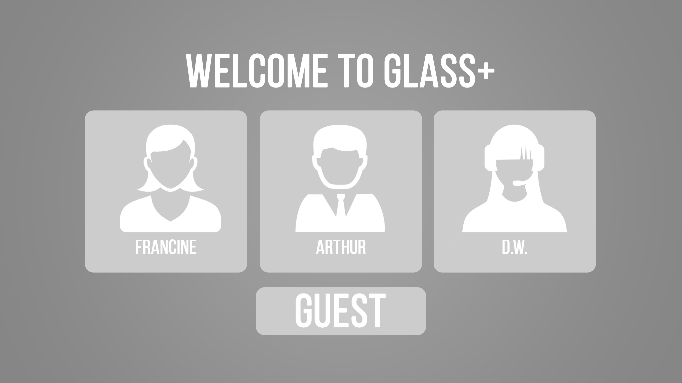
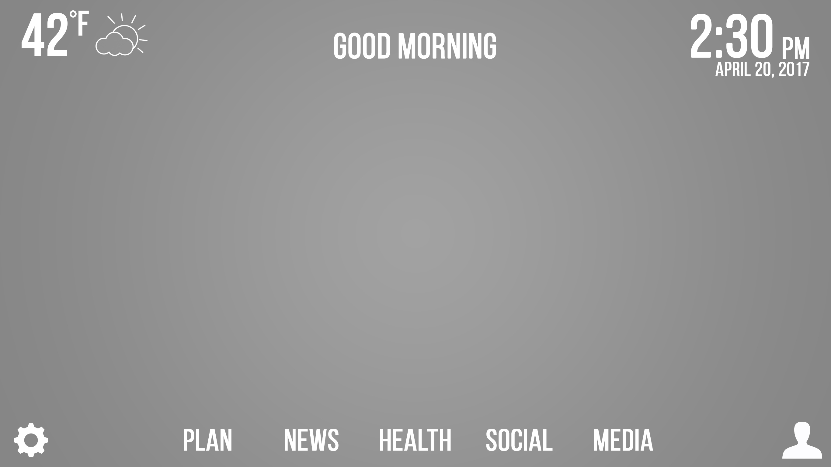
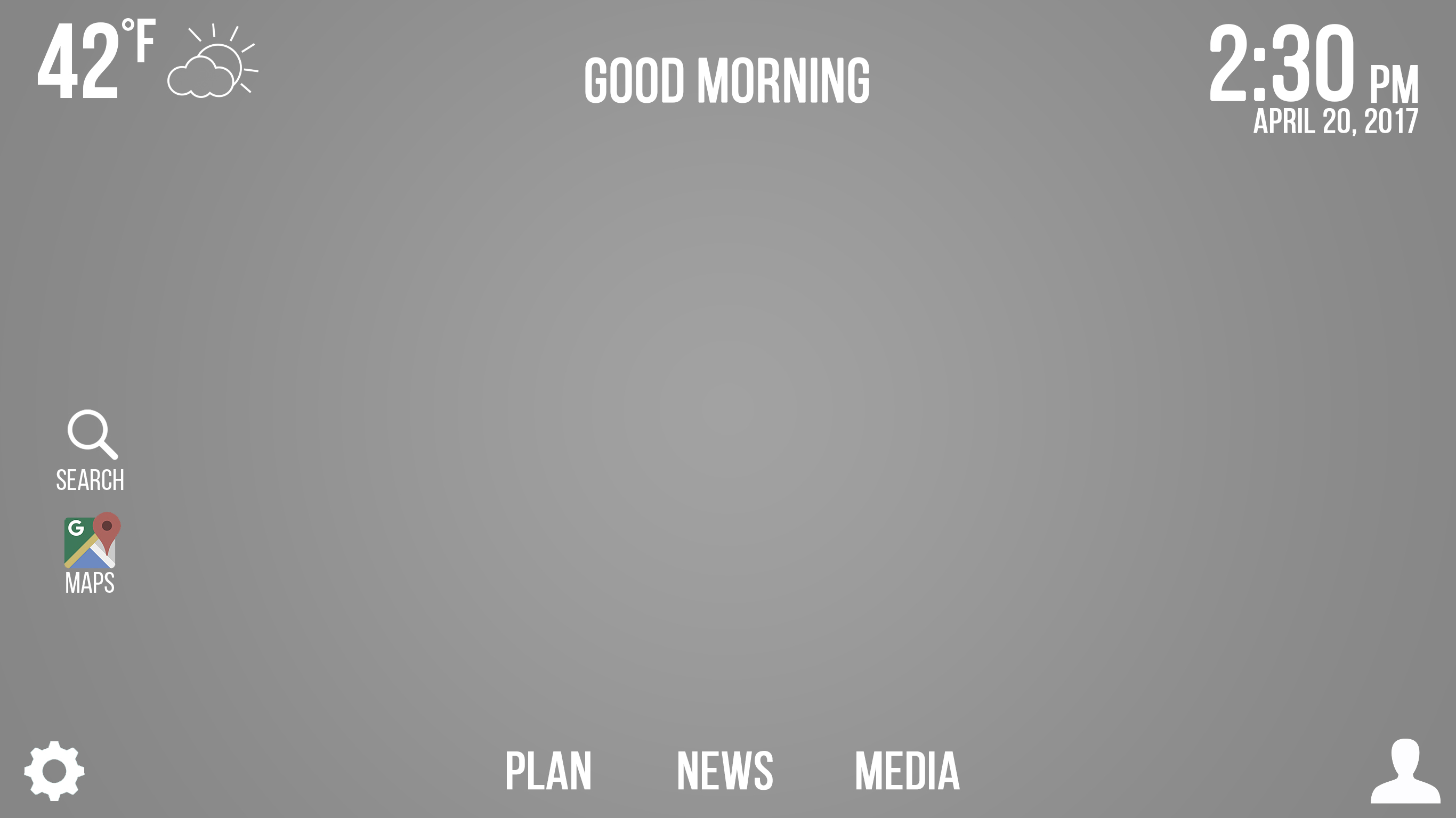
Upon startup, the user is presented with a home screen feauturing large, rounded buttons that take up most of the screen. The user has the option to log in as a frequent user, continue as a guest, or enter a tutorial that will show the user how to utilize the mirror. We chose to use white text on gray buttons, because they will be slightly translucent for a user to use on a screen and we wanted the interface to be non-invasive. We also made sure that all the buttons lined up on a grid so as to provide consistency throughout the design.
Icons
We also chose to use icons that followed a consistent theme, using all-white icons whenever possible to provide consistency. We opted to use universal icons wherever possible, such as using the gear icon for settings and the silhouette icon for users.
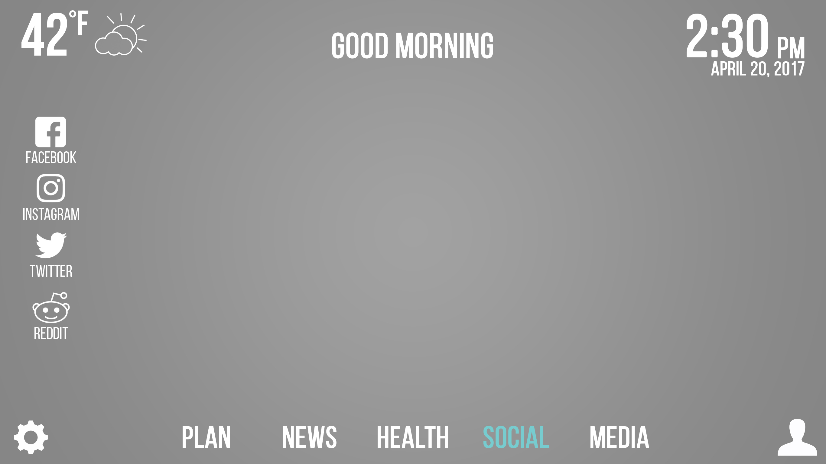
The social tab opens up a variety of social media icons, which all have been changed to white icons to provide a cleaner, more consistent look in the final design.
Functionality and Features
The login screen displays large icons for different users, and also includes the ability for users to decide that they do not want to log in and to continue as a guest.
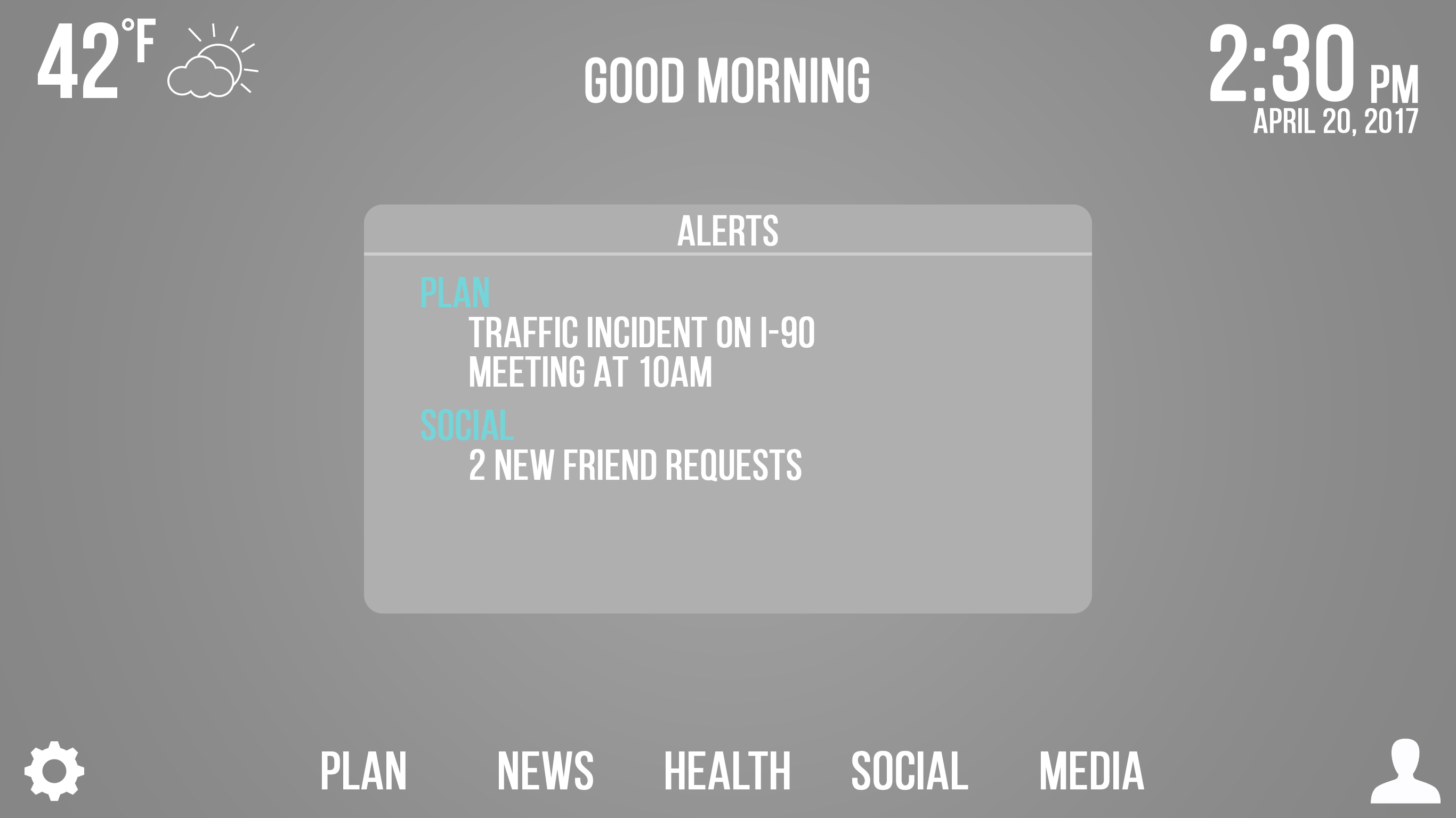
The home screen offers a multitude of docked features that are available to the user throughout their experience. The reason for implementing this design was twofold. We decided that the consistency in the design would make new users comfortable with the interface quickly. Additionally, we decided that the interface would allow for much quicker use for experienced users once they were accustomed to the placement of all the buttons. In the upper left hand corner is the current weather and an illustration of the type of weather. In the top middle is a greeting to the user. In the top right corner is the time and date. In the bottom left hand corner is a gear icon representing the settings menu. In the bottom right is a silhouette of a user that is meant to change users. There are a variety of options to go through across the bottom of the dashboard, including Plan, News, Health, Social, and Media which will be discussed in detail later. We also implemented an Alerts menu which will bring up information that is the most important to the user, including social media notifications, traffic updates, etc. These are also clickable, and will open up the designated folder. We implemented an alert menu in order to give the user important information quickly. We consider this design to be successful because it shows all the most important information in large, white lettering that is easy to read. Additionally, the blue highlight is the least likely to pose problems for color blind individuals, so we planned ahead for color blind users. We categorized all the options that we deemed important in a way that allows the home screen to be extensive, yet clean and without clutter. We also aligned all of our icons along a grid for consistency and ease of use.
An additional image featuring our dashboard in the case that the user does not have any notifications that are displayed on the Alerts bar.
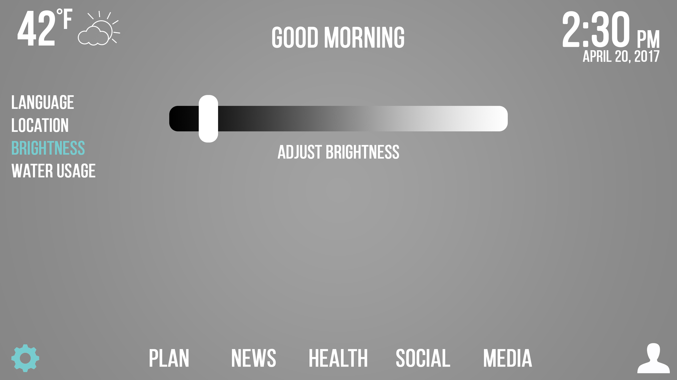
We also chose to implement a brightness function allowing the user the ability to customize the brightness of the screen. In the case that someone is using the mirror at night or during the daytime, they may want the ability to change the brightness for visual purposes or just to conserve electricity.
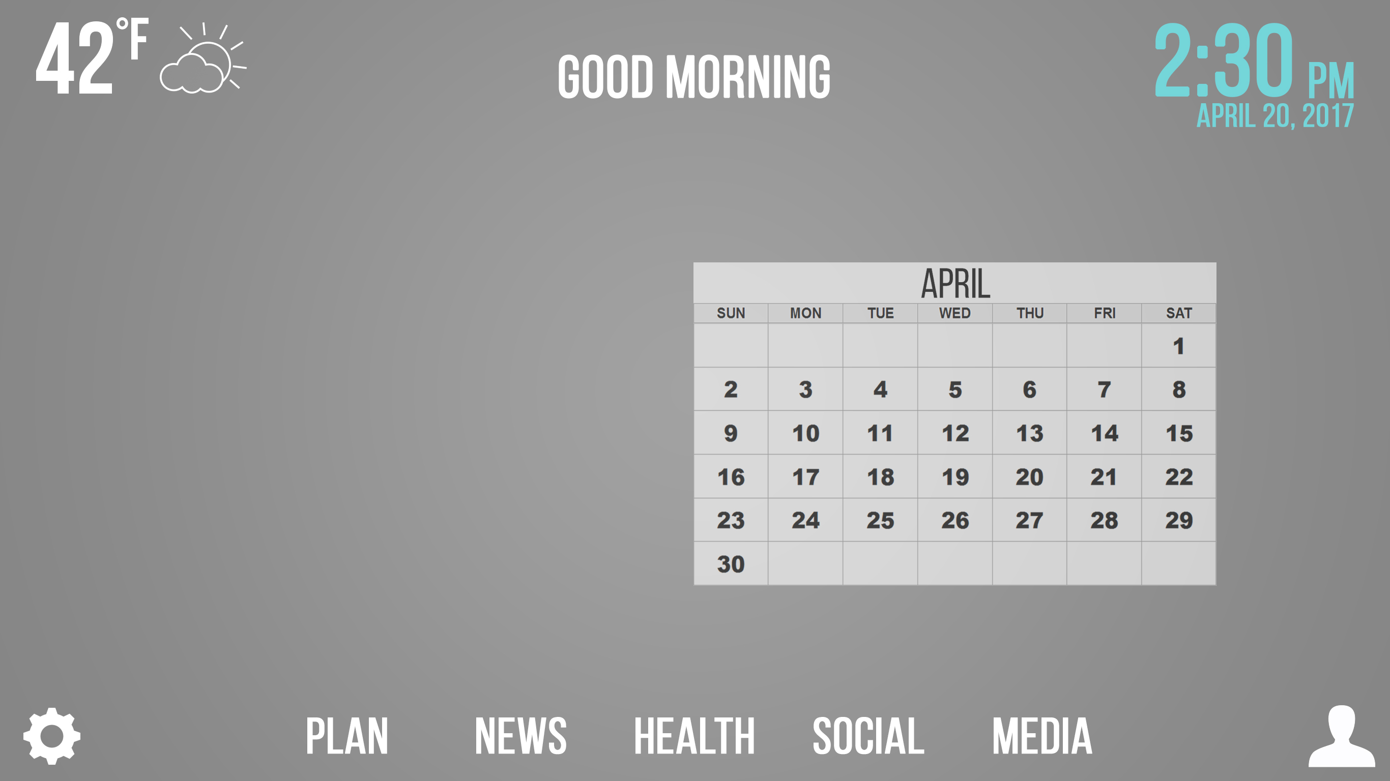
We wanted the user to be able to plan ahead, and because of that we decided to implement the Calendar functionality. Upon clicking on the time in the upper right hand corner, users have the ability to view their agenda on a monthly level and get a month's glance. We chose to have the calendar display towards the right side, since the user will be standing closer to the right end of the screen in order to be pressing that button. We chose to do this with the user in mind, eliminating the need to jump around to the left side.
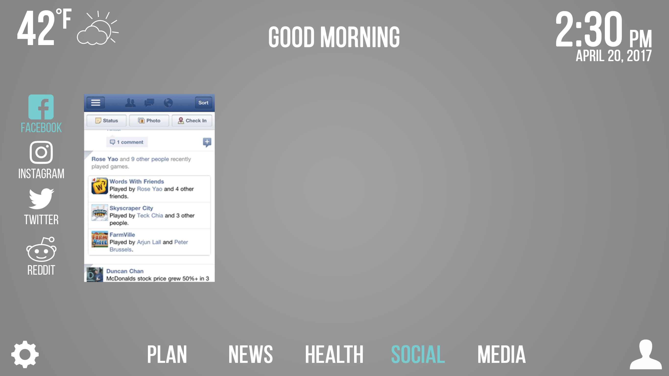
We involved social media options to allow users to stay connected with their peers. Clicking on any of the social media mediums in the Social tab will display that particular feed closer to the left side. All applications that are clicked on from the left panel will appear close to the left side. We implemented this design idea because we didn't want users to have to jump around, and also because aligning our applications to the side allows the user to still have enough space in the mirror to complete their activities without obstructing their view.
We implemented a guest option so that users would be able to use the mirror even if they did not have an account. This comes in handy for relatives sleeping over, and days when the user isn't particularly interested in their agenda and wants to quickly go to the mirror.
The health tab opens up a plethora of information pertaining to the user. We chose to display all information along the sides of the mirror so as not to obstruct the user's view, but also to allow them to view all the information at once instead of having to press additional buttons to get to more of the same type of information.
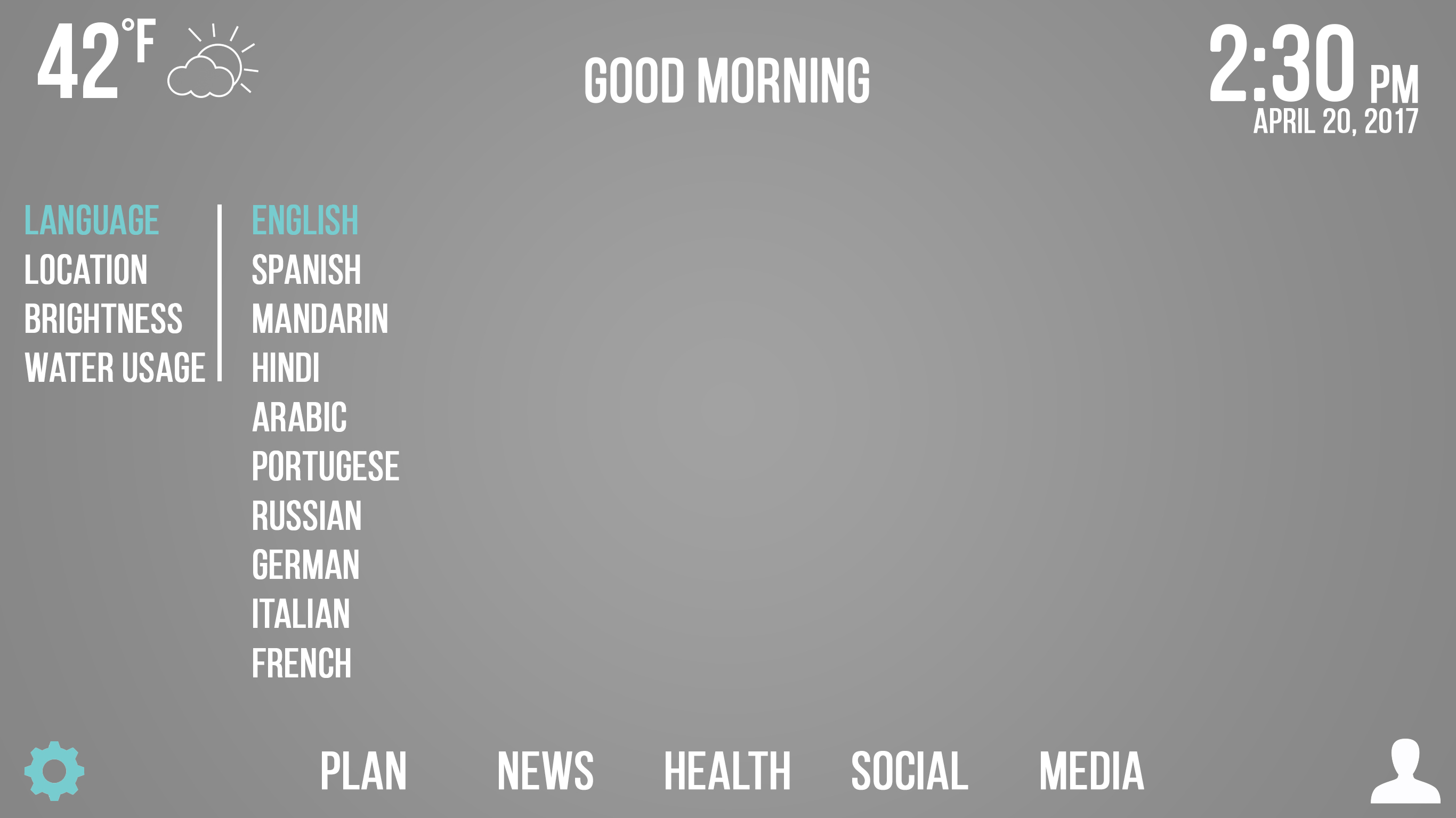
We have provided users the ability to choose their desired language. The two working implementations are English and Spanish.
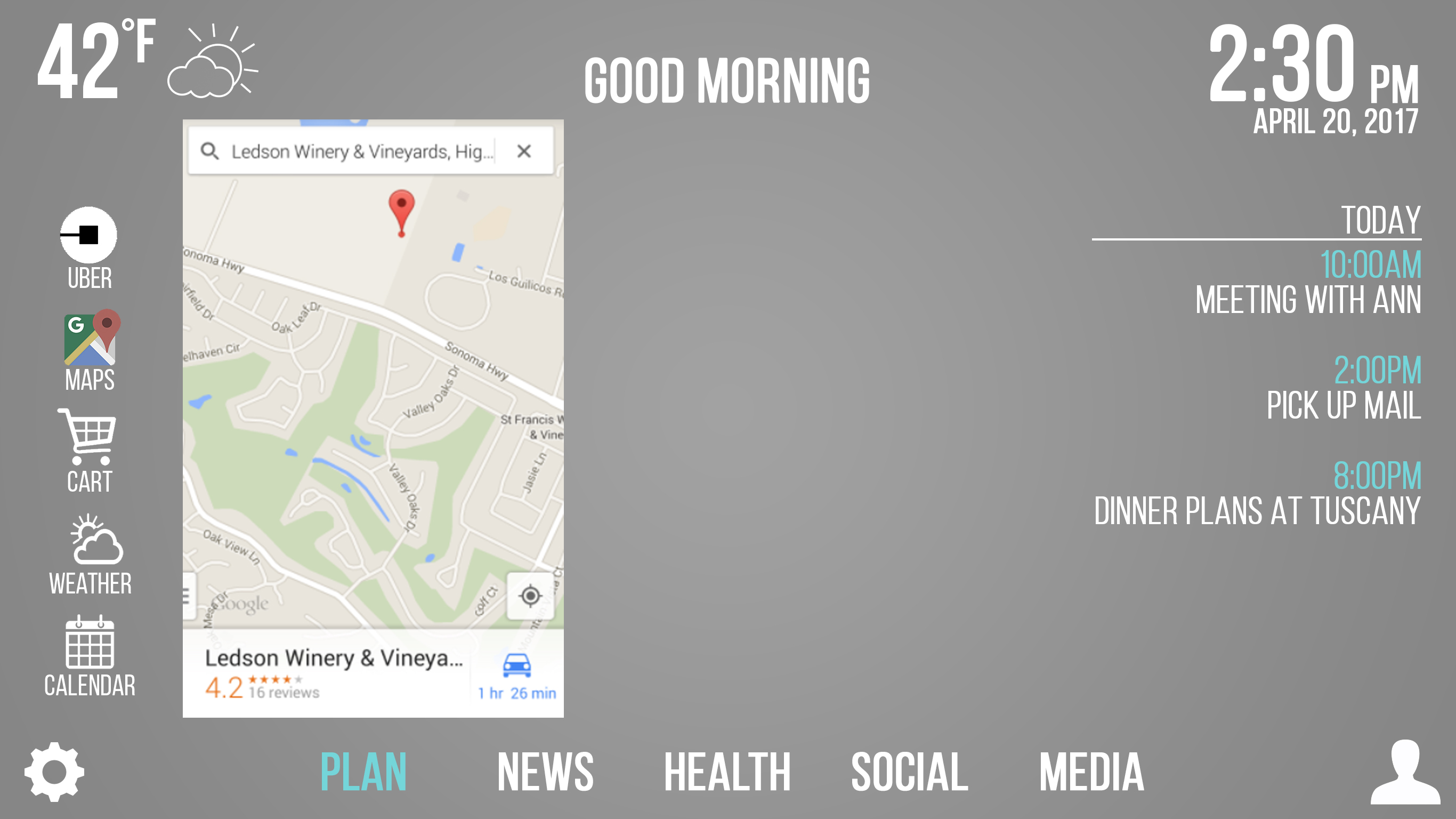
In order to get users to where they need to be, it is often helpful to have directions avaiable while getting ready. For that reason, we felt that adding mapping functionality was a helpful component in making our design successfull. Allowing the user to gauge traffic for the day while getting ready can be a big help, especially for those who commute. We added an image that signifies a lightweight Google Maps application that also is aligned to the left side of the interface.
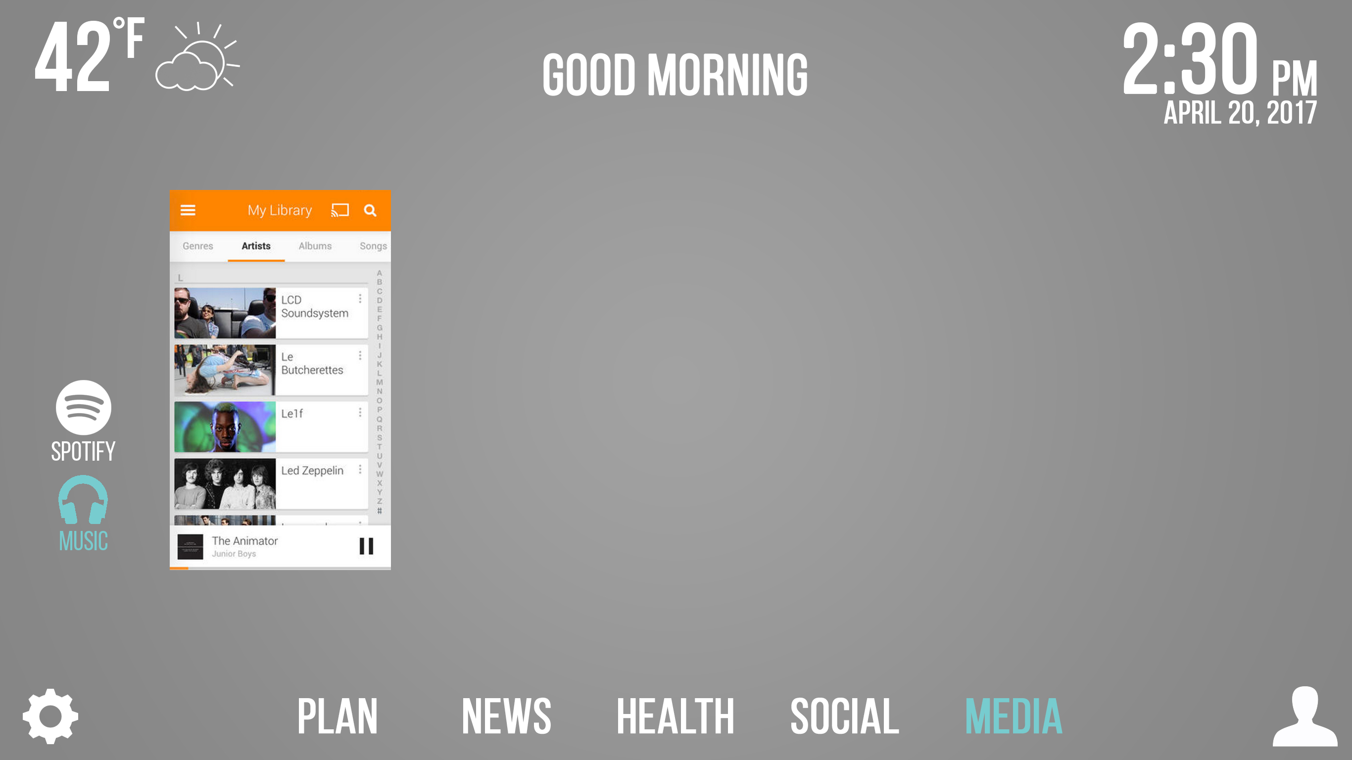
We felt that adding a music option to the mirror would be a good addition to the user experience, so we implemented a music tab that allows users to listen to their music while getting ready in the morning.
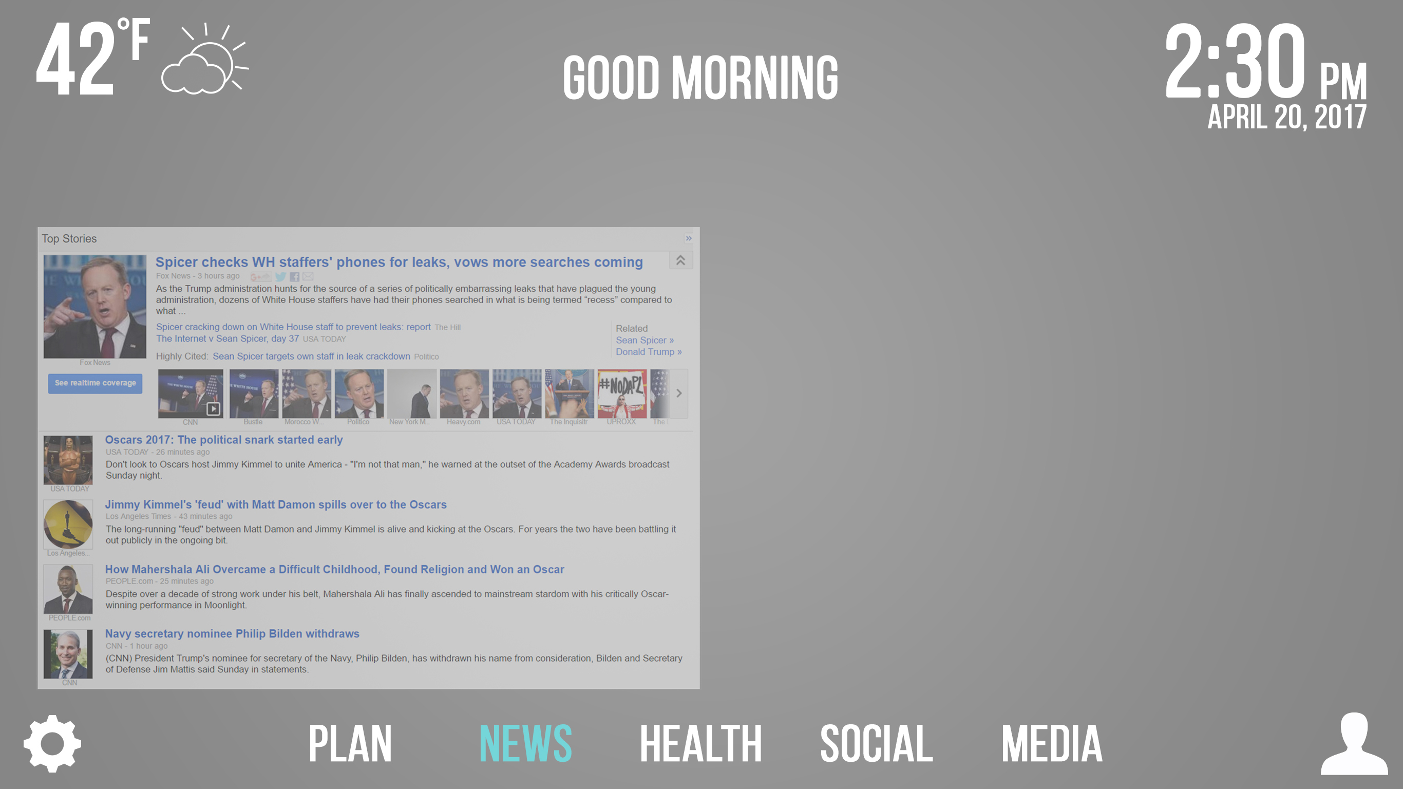
The News tab allows users to stay up to date on current events, providing a feed with the latest headlines.
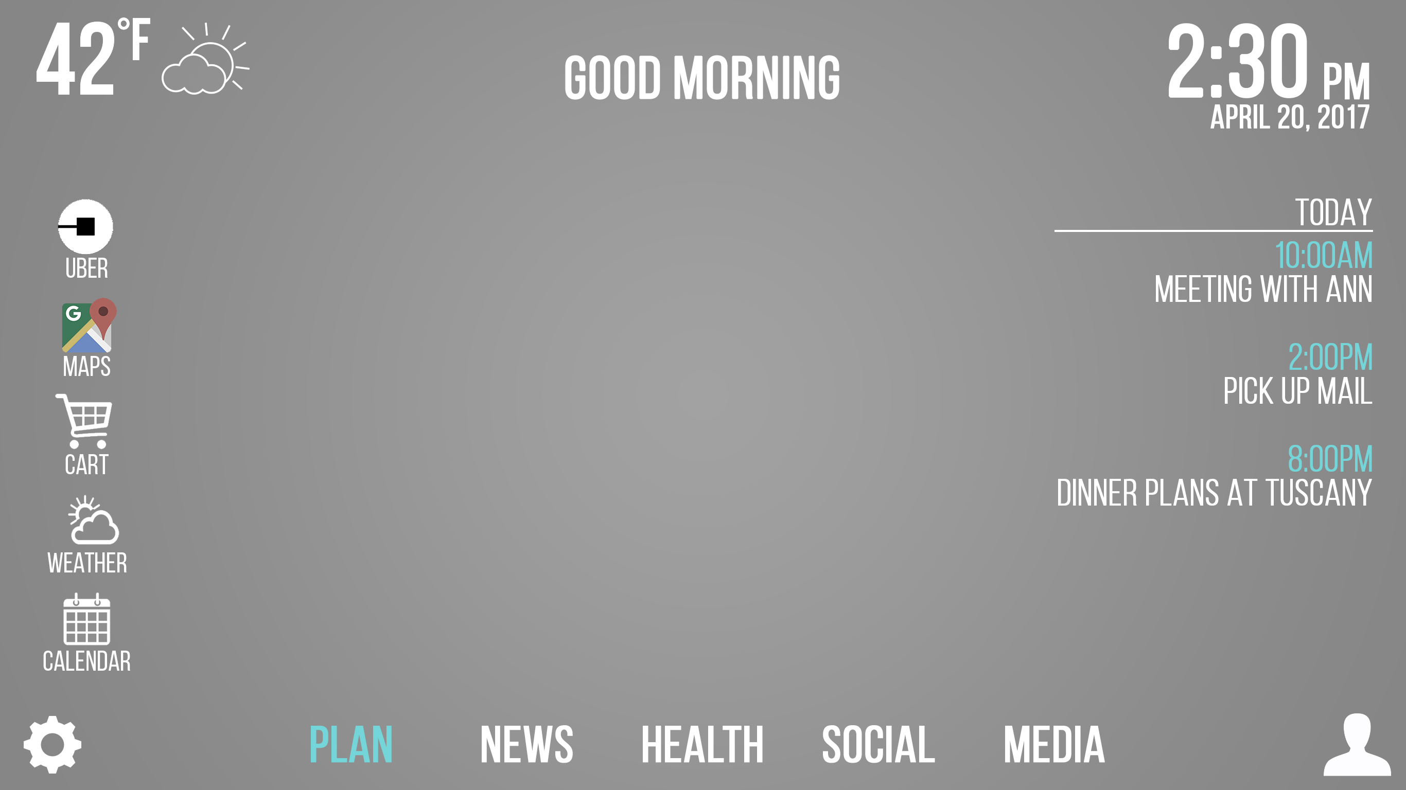
The Plan menu provides users with a few features to help them get their day in order, including a shortcut to Uber and an agenda for the day.
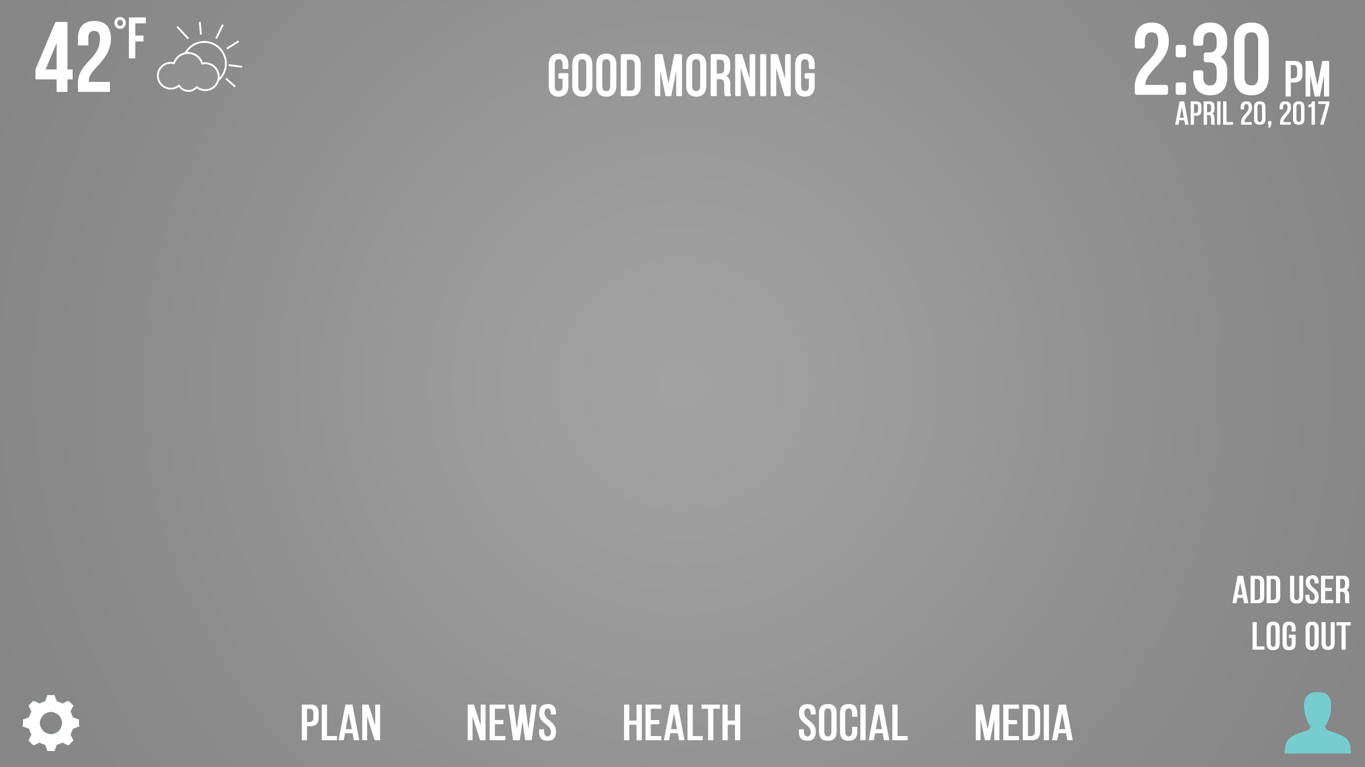
Users can switch user directly from the dashboard.
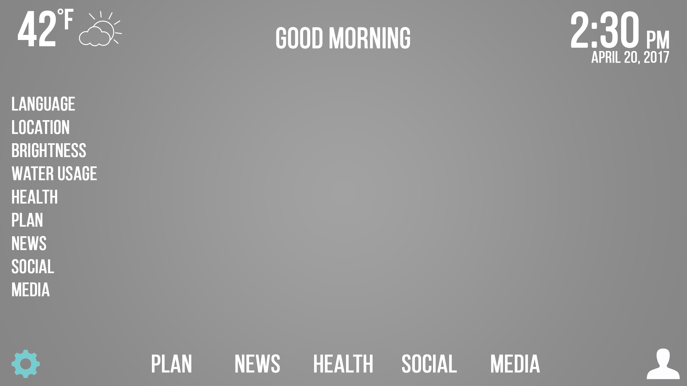
The settings allow users to change the language that they want to use the mirror in, and use a plethora of other features such as location, the ability to change the brightness to their desired level, and to monitor their water usage.
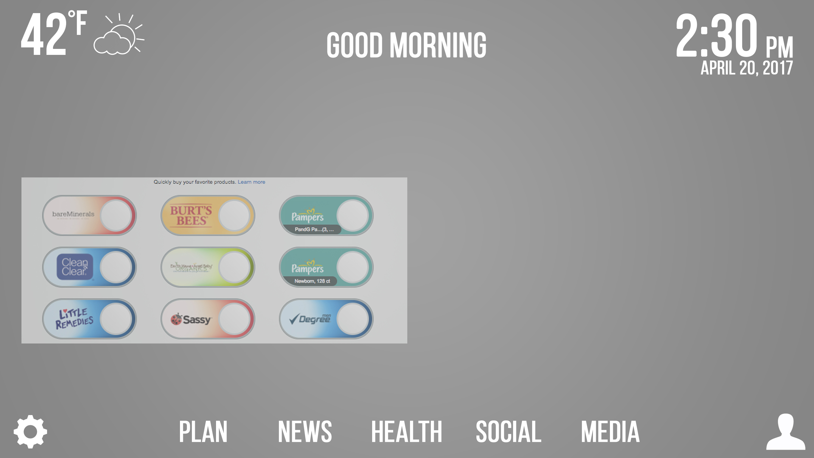
We have provided our users with convenient one-click buttons that pertain to bathroom/bedroom products, so that users can easily order new supplies when they have run out right from their mirror.
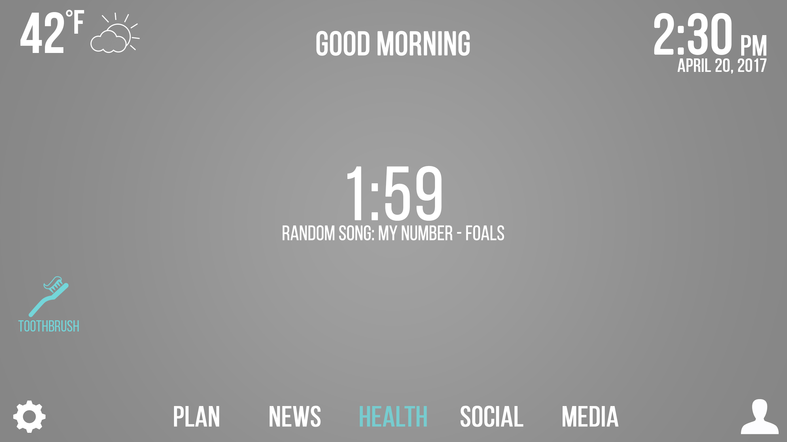
The toothbrush icon will randomly play a song from Spotify for a duration of two minutes, aiding the user in brushing their teeth for the medically recommended time.
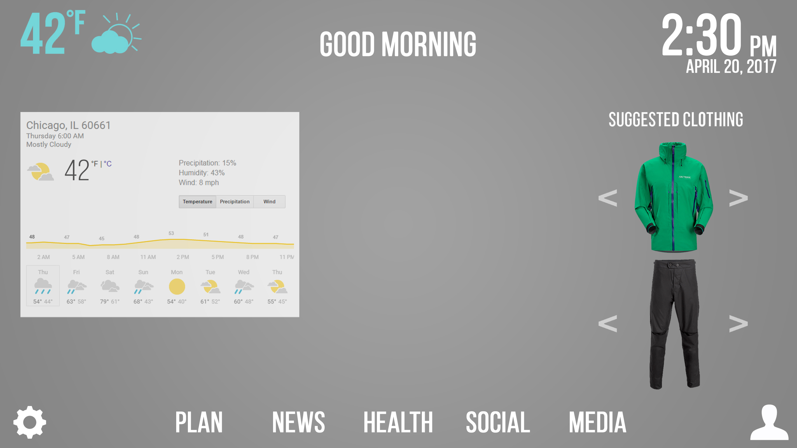
Checking the weather is easy, providing users with a daily forecast, and clothing suggestions for the day.