Collaborated Group Sketch
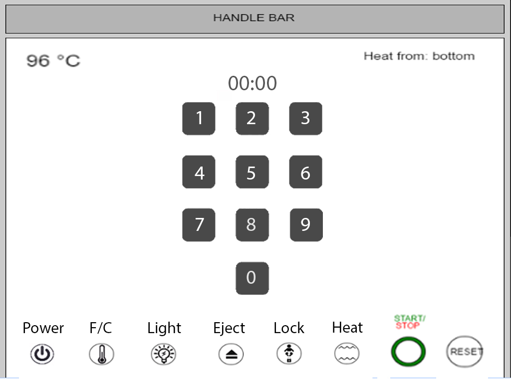
BEFORE

Changes we wanted to make
Based on what we've learned in class, we've revised a few different aspects of Kevin's original toaster according to the design strategies we've seen over the past few weeks
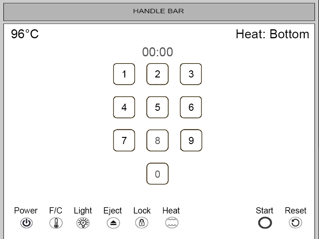
We chose to change the alignment of logos and buttons in his design so that it will all fall within a gridline pattern. We spent the time aligning the buttons in the bottom along with the number pad which created a more consistent look throughout and created a more pleasing user interface.
Based on the information that we've learned from the icon unit, we decided to get rid of the baby icon that represented the lock and replace it with a more commonly used lock logo. Additionally, we thought that the writing for start and stop was inconsistent with the other logos, so we decided to integrate start and stop in with the other logos to create a more consistent UI. Additionally, we separated out the lock, farenheight, light, eject, lock, and heat buttons apart from start and reset, so that the user has some space in between logos so as not to confuse or disorient the user
In terms of text, we decided to increase the size of most texts in order to improve legibility.
In our original design we kind of made weird decisions about where certain text show go and the overall size of the text or icon in relation to their function. We decided to forego that type of design and keep the icon set and text much more uniform and clean. Some specific changes that illustrate that is the allignment and of the top corner's text that reads out the temperature and heat directions. These were made to be lined up on the bottom and have the same font size and color.
We also made small changes to the icons along the bottom of the screen so that there were no strange discrepancies in color or overall design. We also made sure spacing between the icons was consistent and made sense in regards to functionality. Along this same train of thought we made a change to the number pad so that its oberall design and color scheme matched all the other icons on screen. We believe these small' but significant changes provide the user with a much more fluid, clean, and usable interface.
AFTER
